Readable Monospace Fonts
The default monospace fonts on the operating systems I use range from “fairly good” on Mac OS X to “awful” on Windows. This led me to search for alternatives in the hopes that I would find something that is less of a strain on my eyes while I write code. I found a surprising number of good typefaces out there, many of which are even free. I eventually settled on two, depending on what platform I am using.
Inconsolata
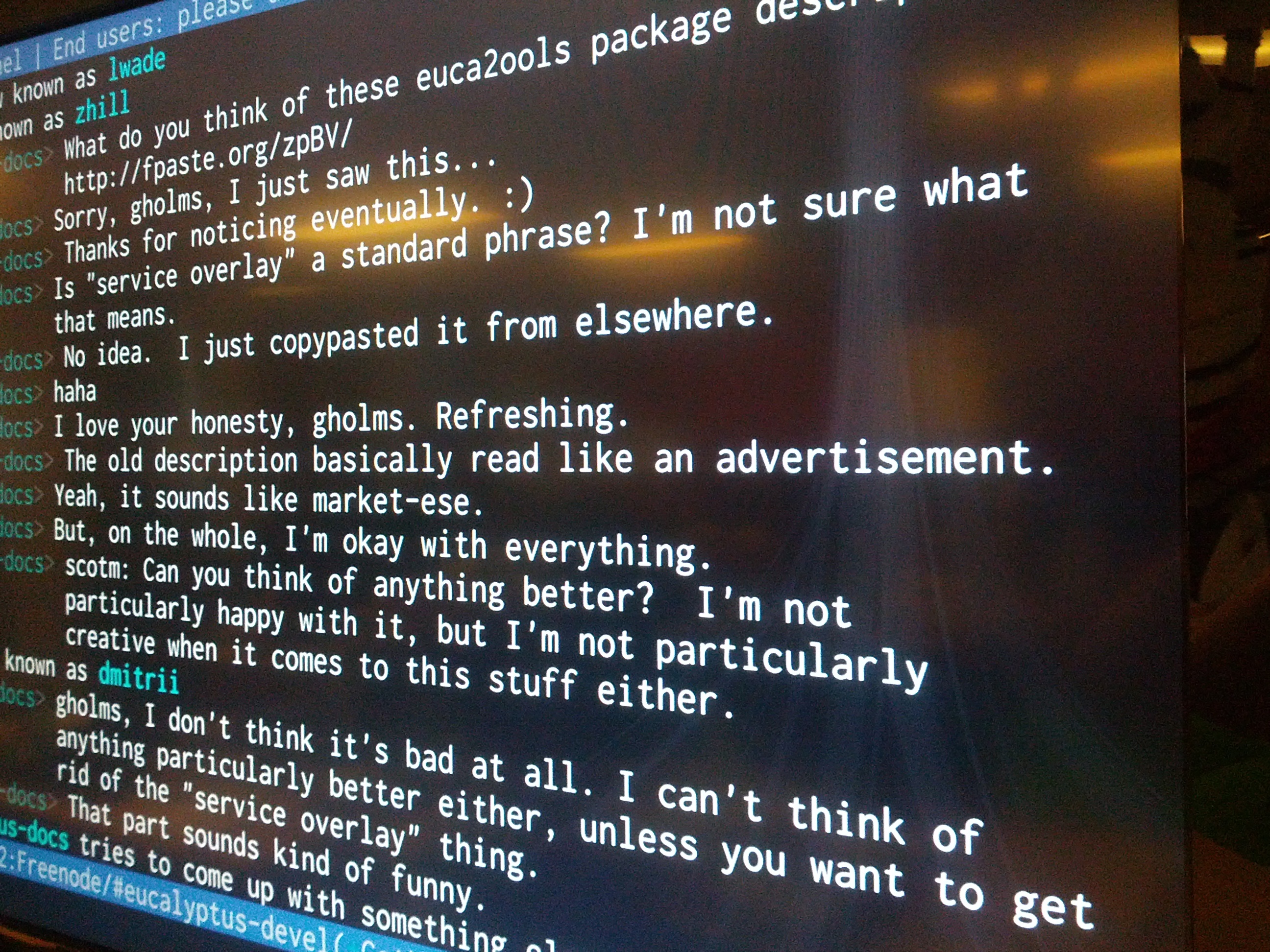
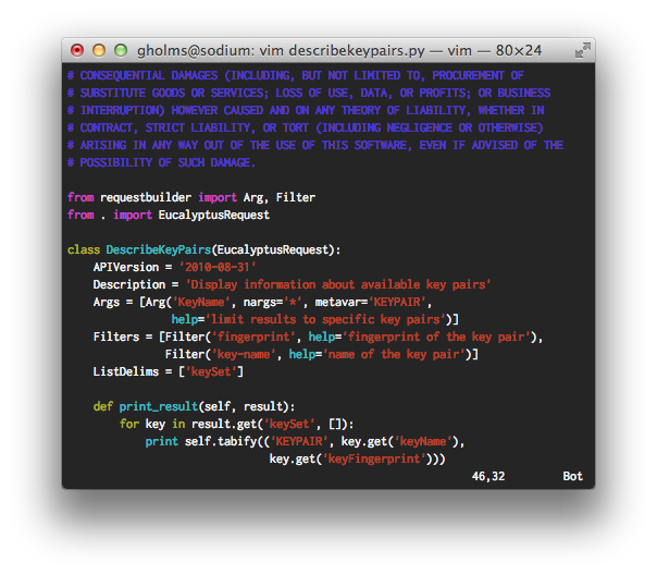
Inconsolata is my favorite monospaced font. On top of that, it’s free. It has its own unique sort of style that is easy on the eyes and yet instantly recognizable. It also scales beautifully to sizes both large and small. I use it on everything from terminal windows to code editors to the huge LCD on the wall at work.
Its main downside is that it doesn’t seem to look particularly great on Windows. It looks amazing everywhere else as long as you remember to turn anti-aliasing on. But even at sizes that are too tiny to use anti-aliasing, it still manages to remain legible.
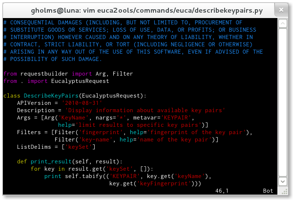
If you use Fedora you can even install Inconsolata using yum.
$ yum install levien-inconsolata-fonts
Consolas
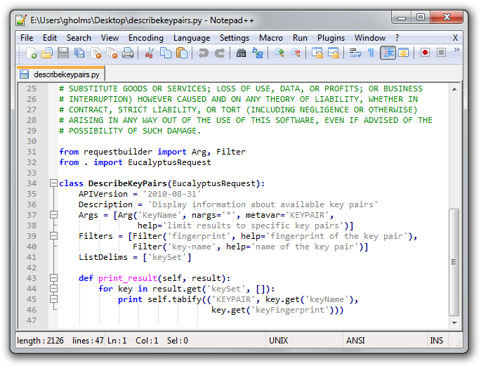
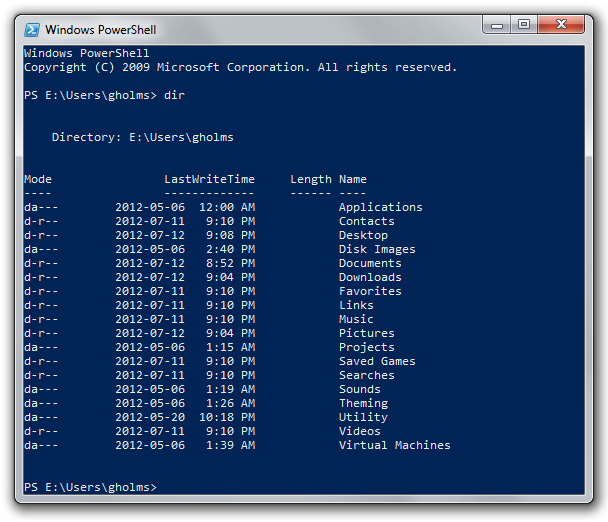
On Windows I use Consolas, a commercial typeface that Microsoft bundles with Windows and Office. It has a sort of roundish appeal to it but still manages to keep just enough of the boxy look that works well for code. It looks cleaner than the Courier New typeface that Windows programs tend to use by default because it drops a lot of serifs that just take up space. Unsurprisingly, it also blows the ancient, raster-based one that the command prompt uses out of the water. Just don’t forget to leave anti-aliasing on.
